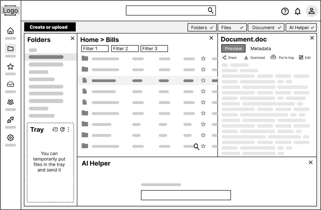
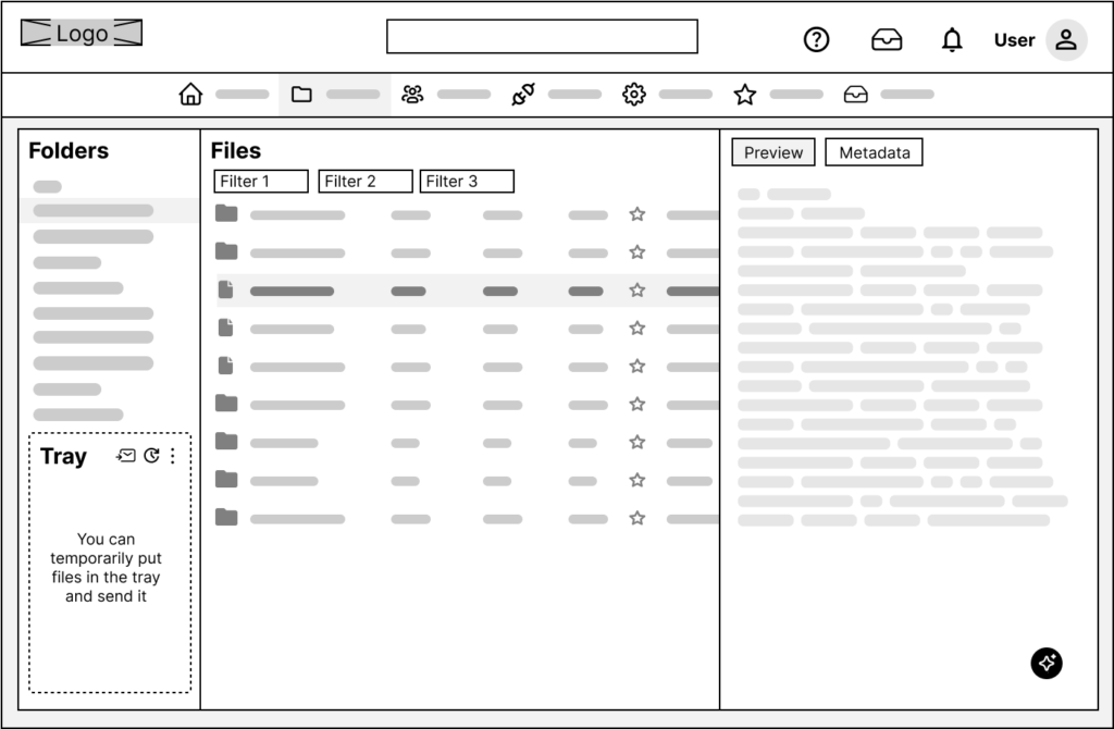
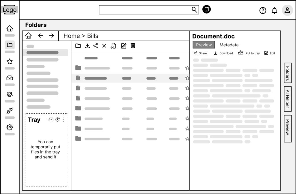
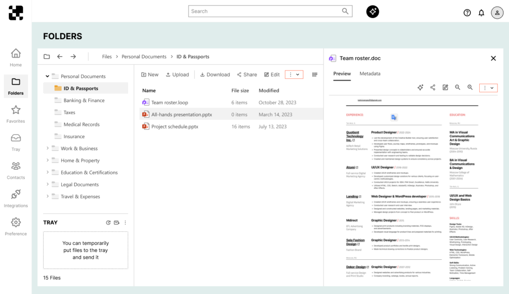
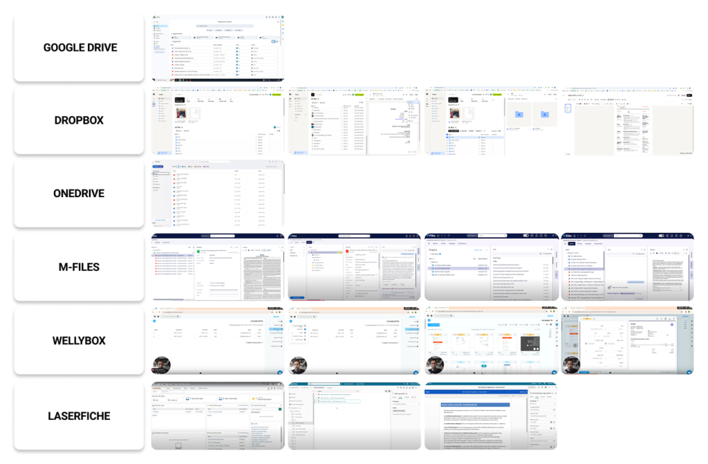
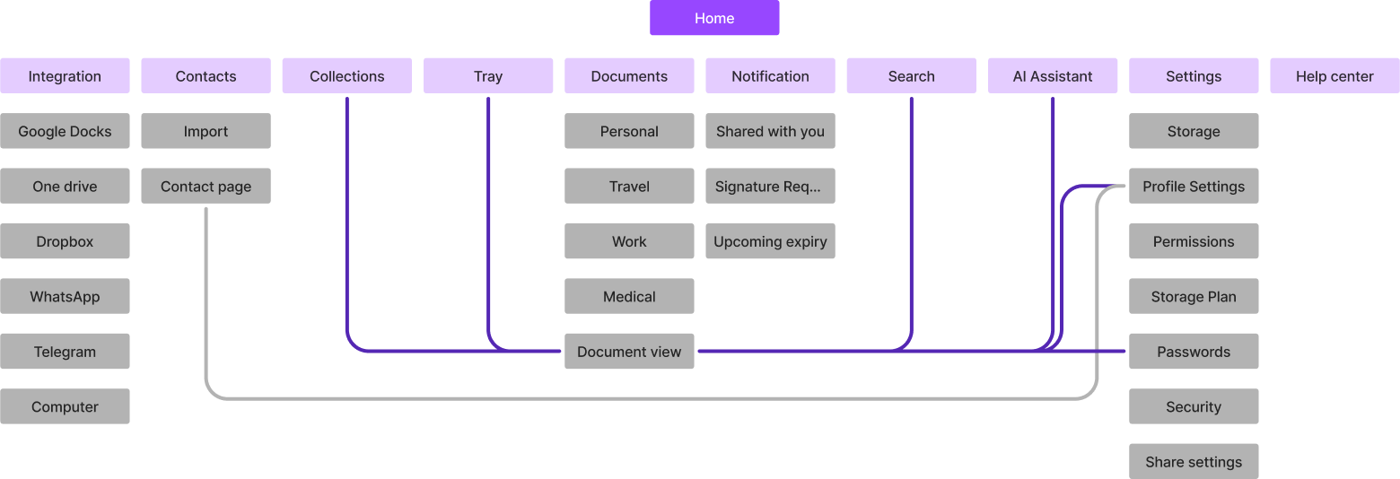
A UX case study on designing a smarter system for organizing, finding, and managing personal digital documents—all in one place.
UX research
UX design
UI design
Figma
FigJam
High Fidelity Mockups
As part of my final project for a UX design course, I created the concept for SuperDoc — a digital system for storing, searching, and working with personal documents. In today’s world, files arrive through dozens of channels: messengers, email, cloud services. People often struggle to quickly find the documents they need, especially in stressful situations like tax filing or legal requests.
My goal was to design a clear and user-friendly system that helps bring order to digital paperwork and reduce the anxiety caused by scattered or lost files.
The primary users of SuperDoc are individuals who regularly manage personal or work-related digital documents across multiple platforms — such as cloud storage, email, messengers, and local drives. These include:
At the first stage of the project, I conducted an online survey with 64 participants of different ages and employment statuses, including full-time employees, freelancers, unemployed individuals, and retirees. Most of them work with documents several times a week or even daily, which highlights the relevance of the problem.
of users encounter problems with finding documents several times a week.
say that their files are scattered across different platforms, making it hard to keep track.
admit they often forget where they saved a document.
store their files in a mix of emails, cloud drives, messaging apps, and local folders — creating digital chaos.
To better understand user behavior, I conducted interviews with survey participants. These helped reveal deeper context and pinpoint where breakdowns occur. For example:
Mika Shleiman
15:20
“I clearly remember someone sent me a file on WhatsApp, but then I couldn’t find it anywhere — it just got lost in the flow.”
Daniel Oz
25:30
“I urgently needed to find my rental agreement, but couldn’t recall if it was in my email or among scanned files on my computer.”
Sagi Klein
10:24
“I just want to organize everything — right now, it’s a mess, and that really frustrates me.”
The next step in my process was conducting a competitive analysis. I divided competitors into several categories:
Cloud Storage Services: e.g., Google Drive, Dropbox, OneDrive
Billing and Invoice Management Services: e.g., Wellybox, M-Files, Laserfiche, QuickBooks, GreenInvoice
This analysis helped me understand what features and advantages competitors offer, how they work, and what differentiates my product. 
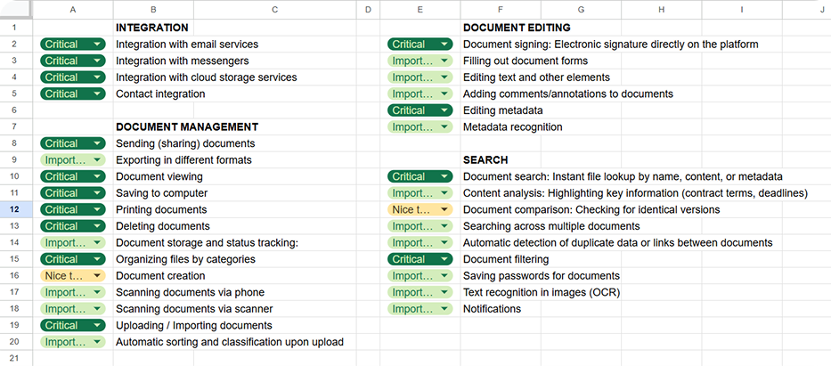
There are many document-related services available, and most users are already familiar with at least some of them. However, none of these solutions fully address the core problem identified in my research: 
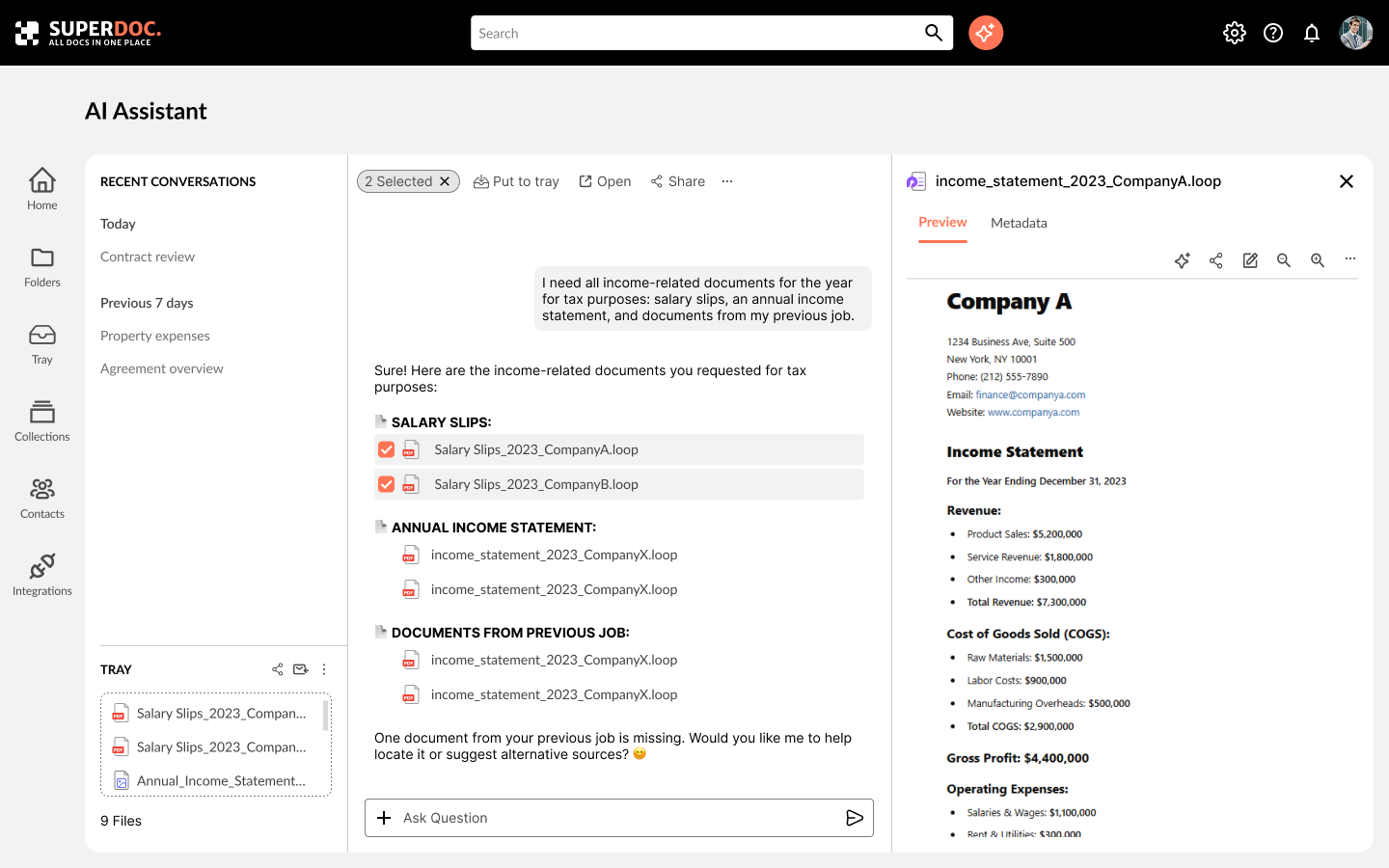
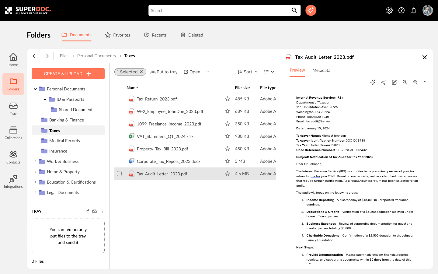
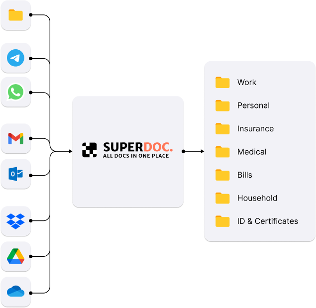
Easy organization with truly fast and intuitive search.
Based on the insights gathered from interviews and surveys, I created a list of product requirements, categorized by priority:
After completing user research, I moved on to the next phase — developing the system’s information architecture. My goal was to create a logical, intuitive structure that reflects real-life document management scenarios.
To better understand how users think about digital documents and categories, I used the card sorting method. During this stage, participants (friends, colleagues, and classmates) were given cards labeled with features or document types and asked to group them in a way that felt natural to them.
Based on the results, I identified the following key sections of the system:
From the full range of user needs, I focused on the most fundamental and critical one: document search and storage. This is the core of the product — without it, actions like signing, analyzing, or sharing documents aren’t possible.
During user interviews, I noticed a recurring behavior pattern: users often gather needed files in a single folder (like “Downloads”) on their computer, then email them. This creates duplicates and confusion about file versions.
To simplify this workflow, I introduced a feature called “Tray” — a temporary space where users can collect selected files directly within the system, without moving them from their original location. These files can then be shared, sent, or deleted in bulk.
👉 To explore how this works in practice, I mapped out a user flow showing different search scenarios:
After creating low-fidelity wireframes, I conducted several 1:1 testing sessions with potential users. The goal was to find out whether users understood what the interface was for, how navigation worked, and what actions were available on each screen.
Most participants quickly grasped the main functionality and screen navigation logic. However, some had trouble understanding how the AI assistant worked. Based on the feedback, I made layout changes and ran follow-up tests with different users, which helped validate the improvements.
Once the system structure was clear, I created a mid-fidelity prototype as an intermediate step before final visual design
In this project, I went through the full UX process — from research and problem framing to testing and final interface design. I focused on a single, highly relevant feature — the Tray — that solves a specific user pain point, and I tested it in real-world scenarios.
I learned to make faster design decisions backed by real data, and to build interfaces based on logic and structure, not just aesthetics. This project was a great exercise in turning an idea into a functional, user-centered digital solution
© Sergey Kalinin • All Rights Reserved