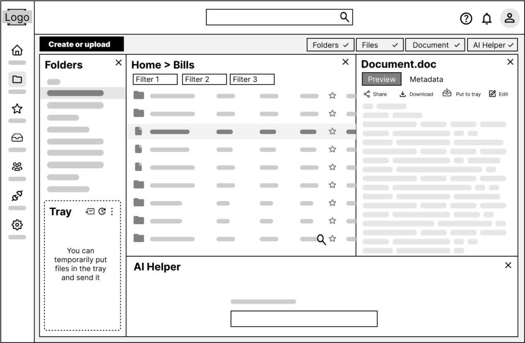
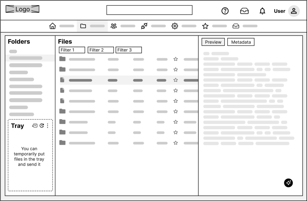
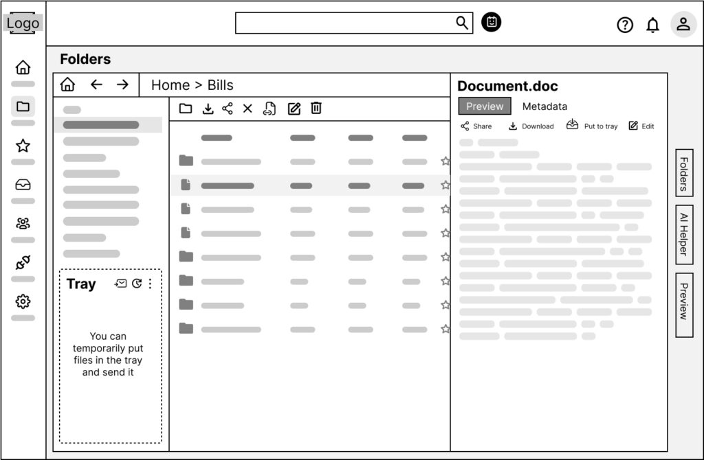
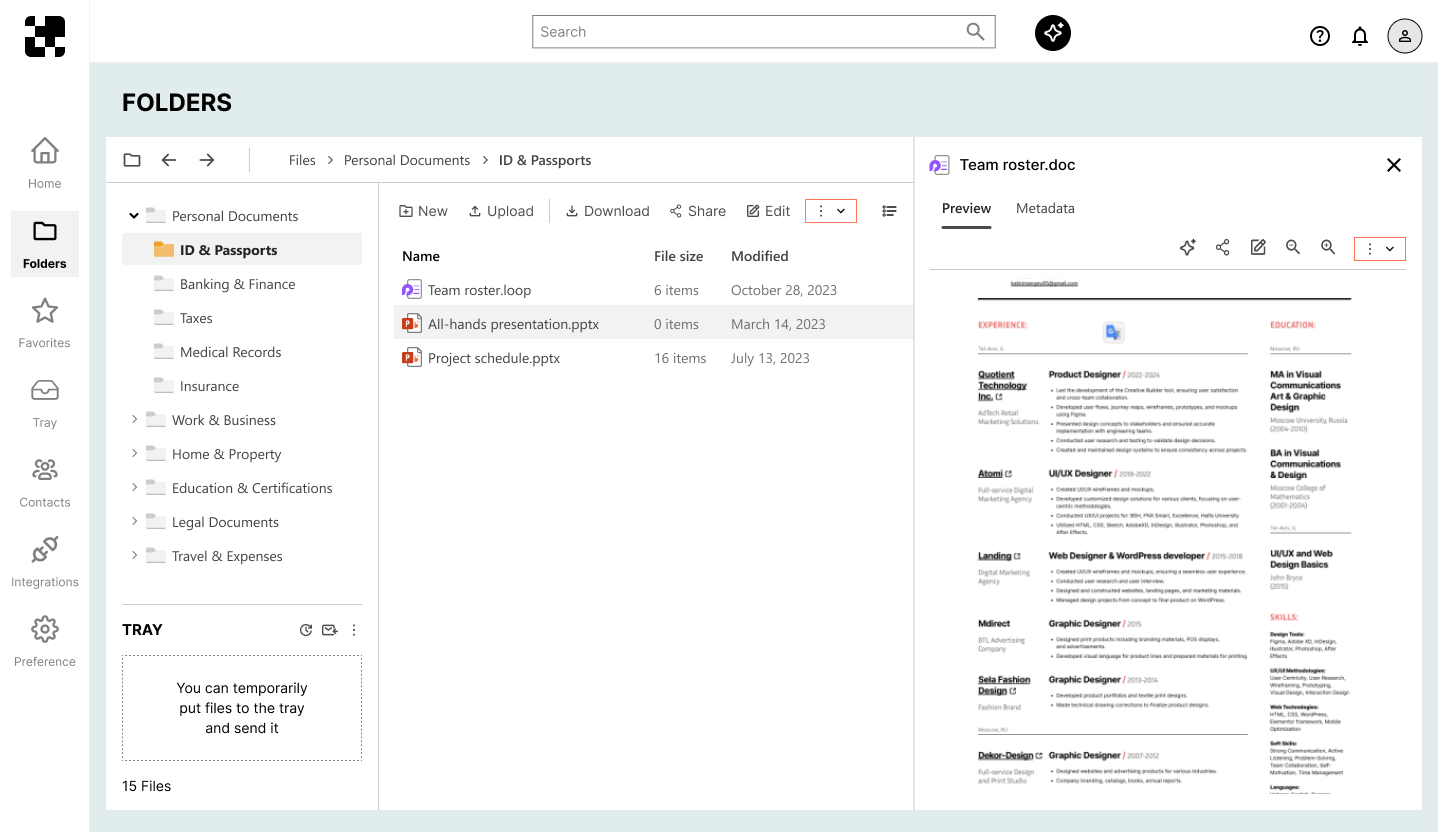
Testing sessions
After creating low-fidelity wireframes, I conducted several 1:1 testing sessions with potential users. The goal was to find out whether users understood what the interface was for, how navigation worked, and what actions were available on each screen.
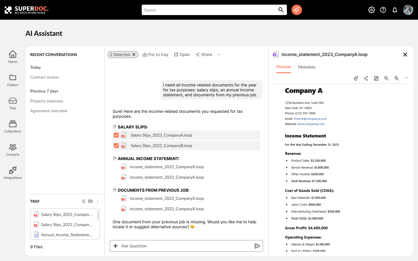
Most participants quickly grasped the main functionality and screen navigation logic. However, some had trouble understanding how the AI assistant worked. Based on the feedback, I made layout changes and ran follow-up tests with different users, which helped validate the improvements.