Design System
Since its launch, the Quotient Media Platform (QMP) has evolved, changed names, and gained new features. The design of the creative builder highlighted these needs and led us to reassess the entire system.
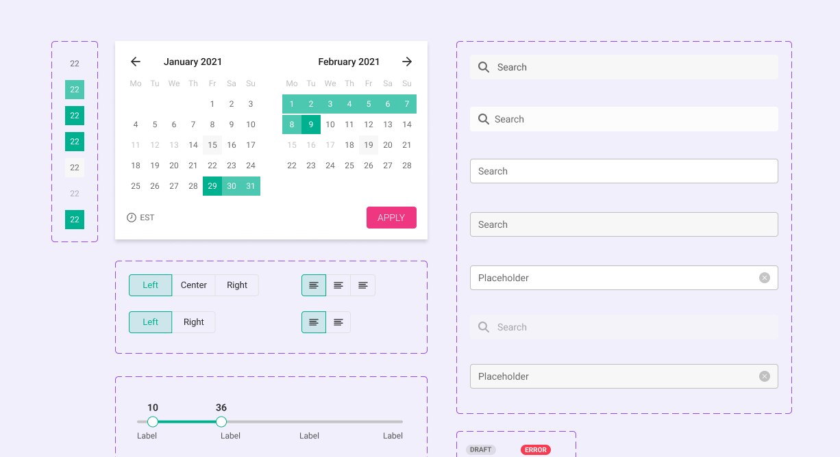
QMP Design system
Since its launch, the Quotient Media Platform (QMP) has evolved, changed names, and gained new features. The design of the creative builder highlighted these needs and led us to reassess the entire system.
My role included researching user interfaces, creating reusable components, and establishing clear standards for building the platform’s interface. Throughout the project, I collaborated with the design team, product managers, and engineering to successfully launch these improvements.
Discovery
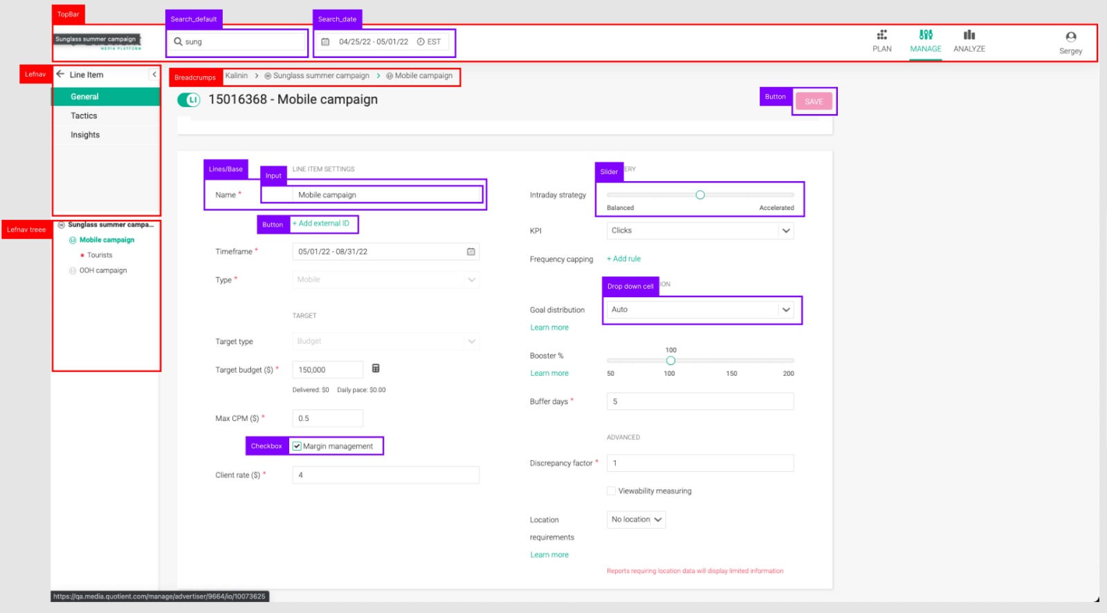
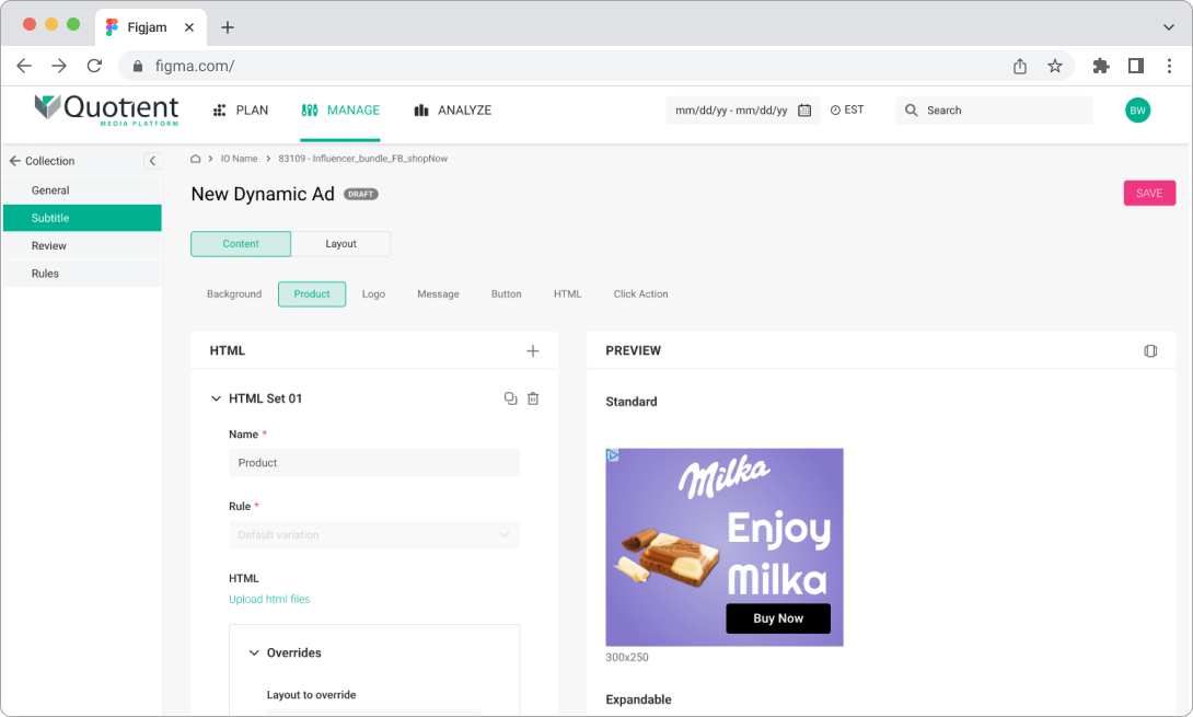
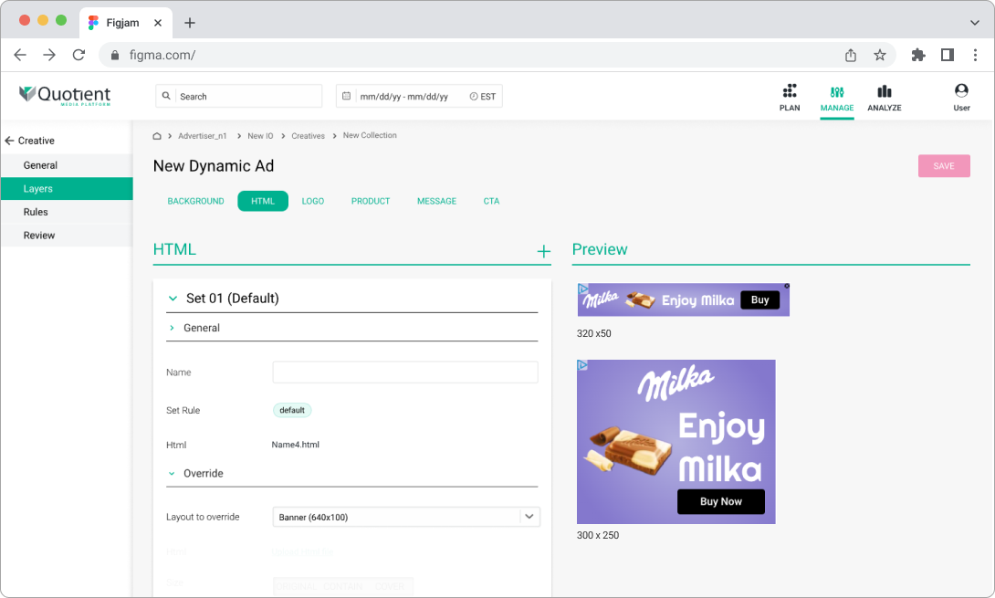
We discovered various designs for each level of text and inconsistency in style.
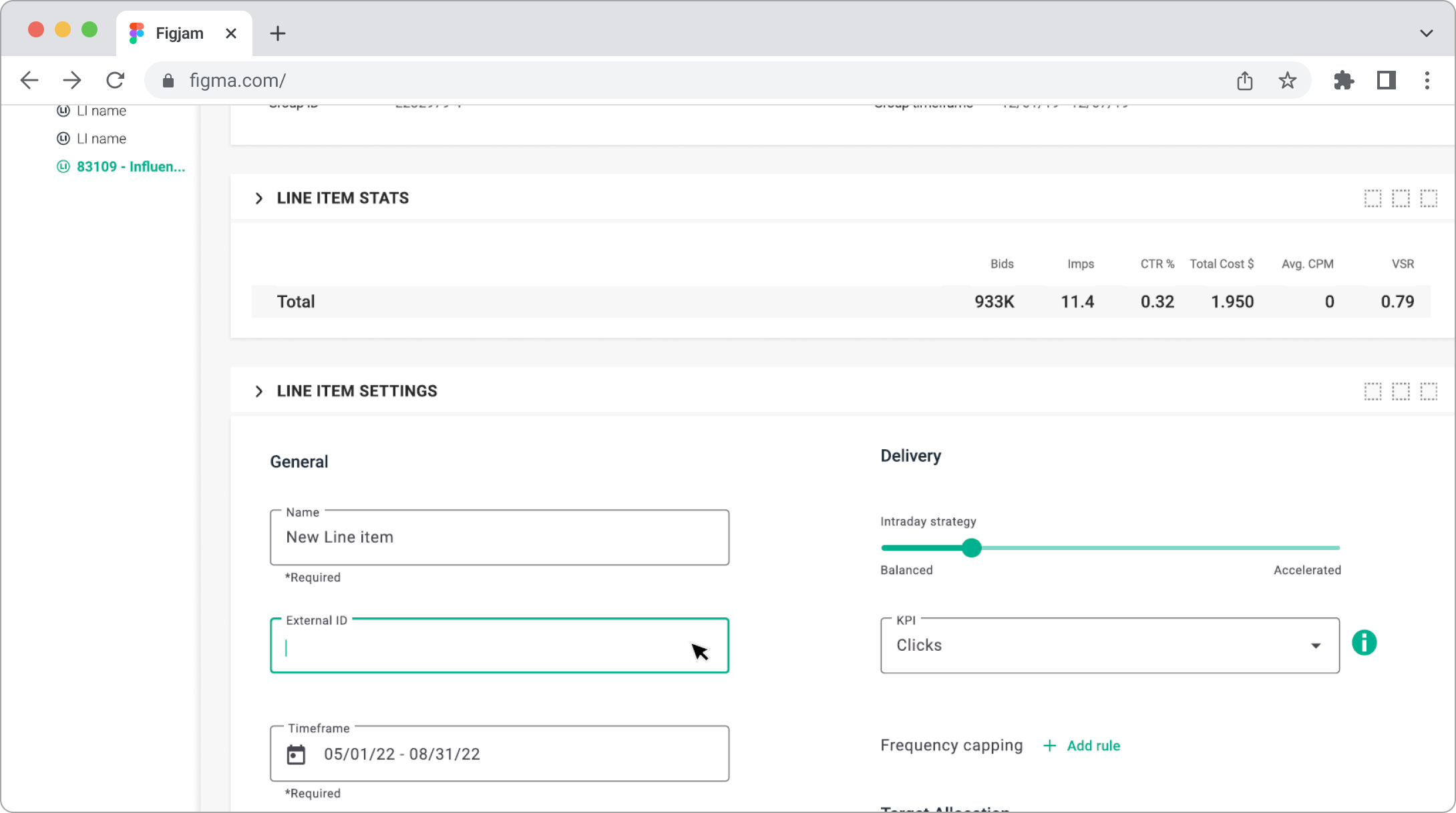
In order to understand the current text state in QMP, we conducted research, collected, and categorized all the titles and text styles that we have in the system. Below is an example showing various text title variations.
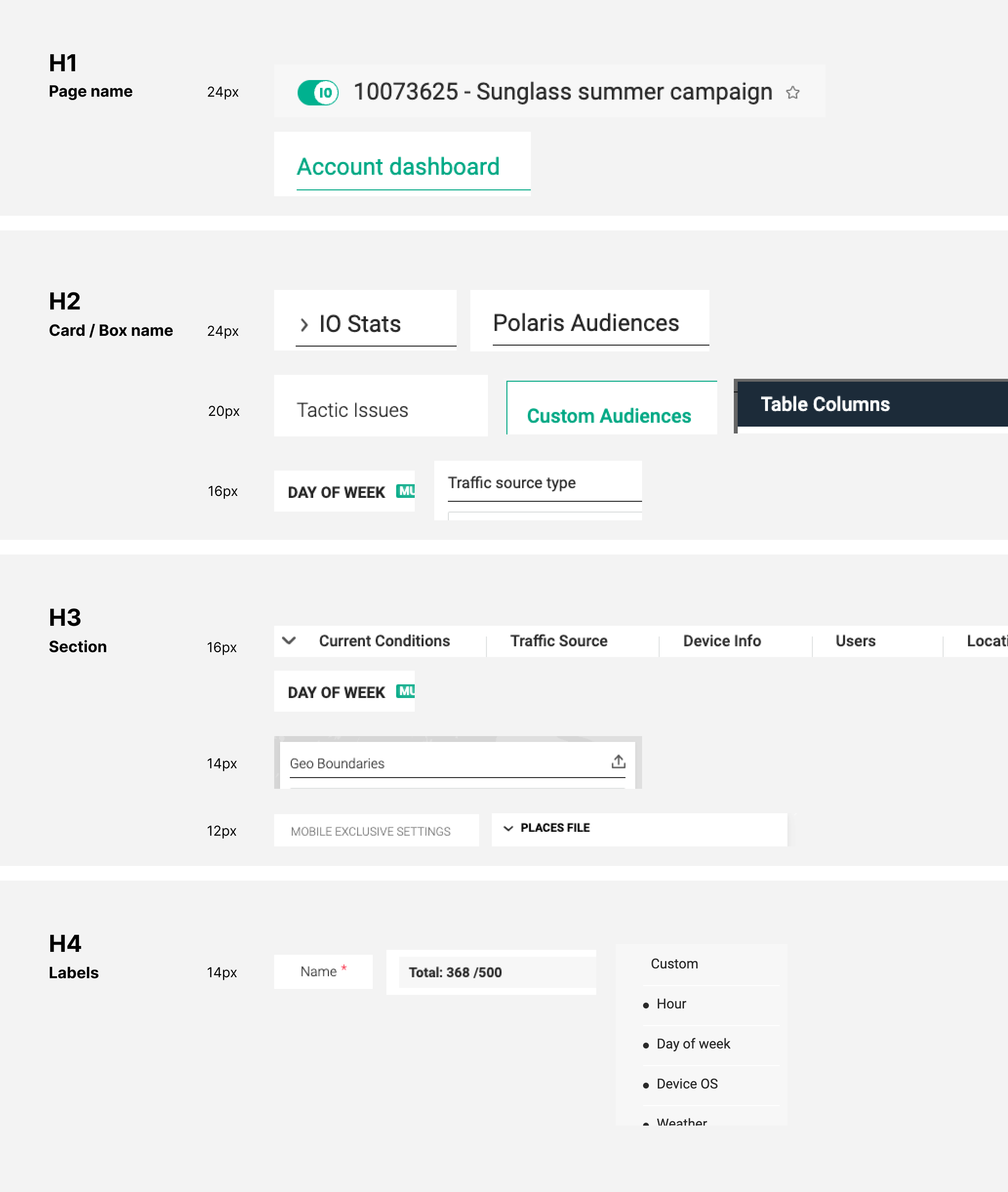
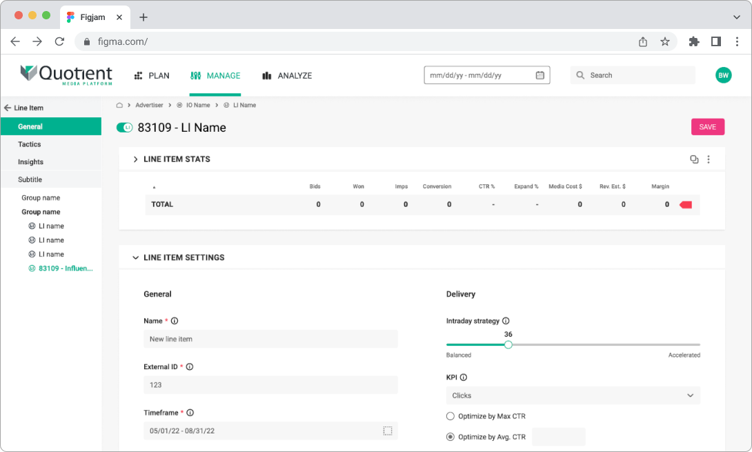
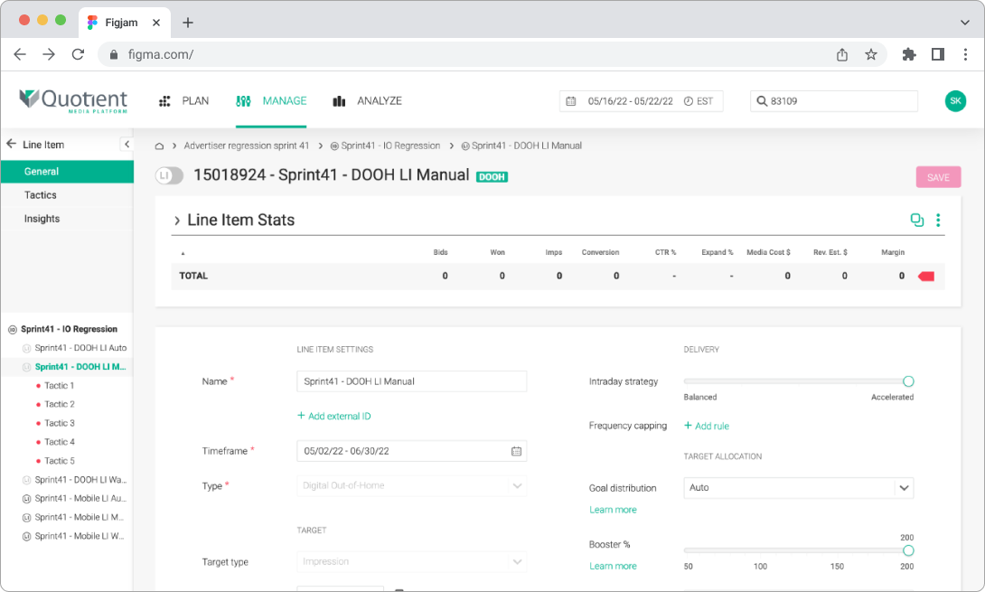
The QMP forms were shaped step by step, adding new components throughout the years.
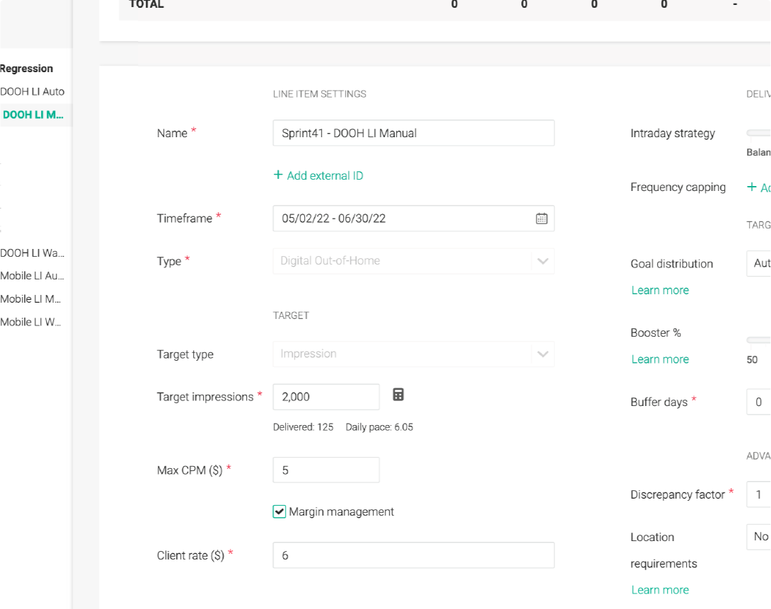
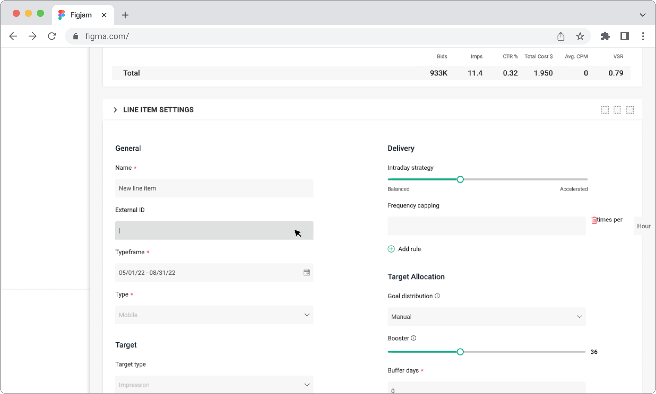
Now we have a very complex form with different sizes of text fields and unclear titles. Below is an example illustrating a violation in the titles hierarchy, where the section title is much smaller than the input label. Additionally, having labels located to the left of the form complicates the perception of information.
Redesign Title Styles and Typography
The current system had a variety of title styles with no standardization, causing confusion and inconsistency. By redesigning title styles and typography, we aim to establish clear visual hierarchies. This means defining specific styles for headings, subheadings, and body text to ensure users can easily differentiate between different types of information and navigate the platform more effectively.
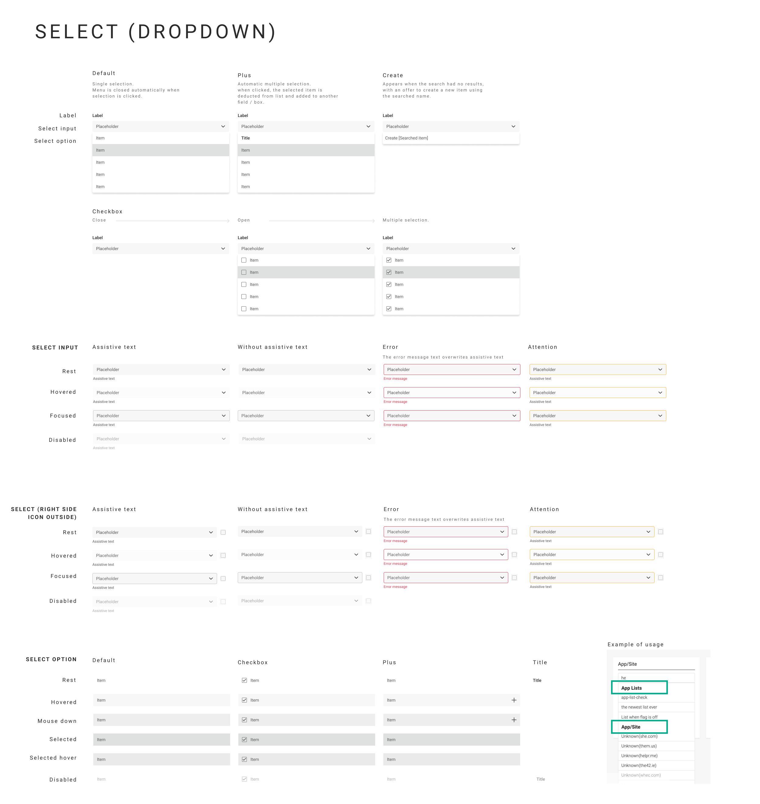
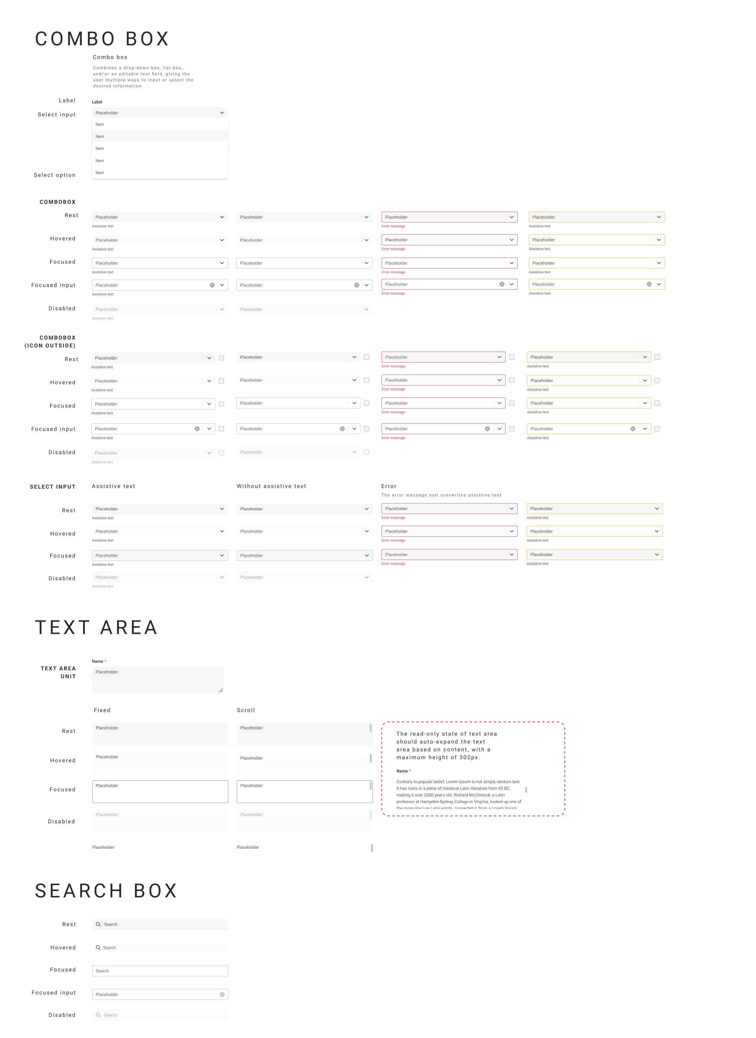
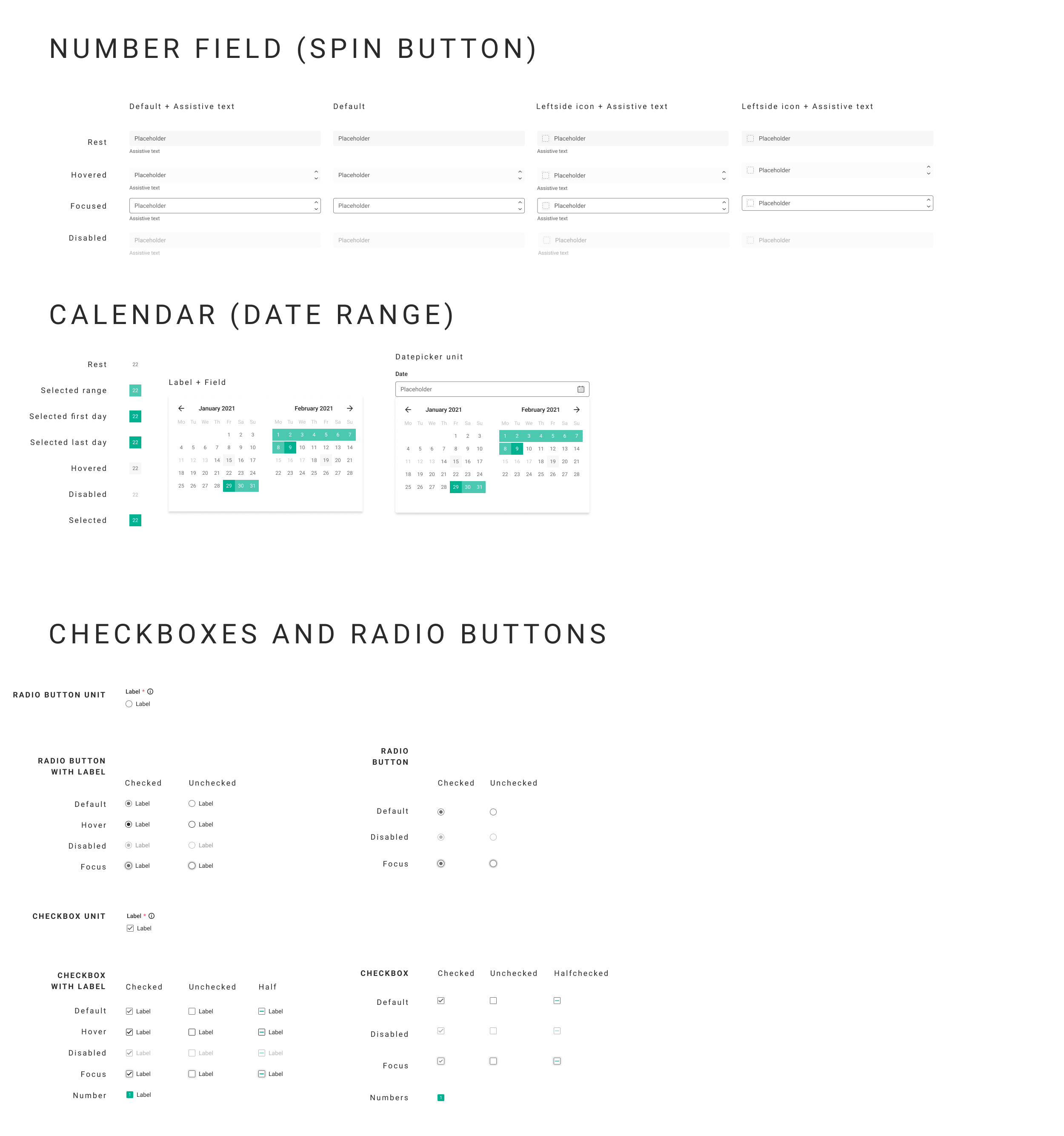
Redesign Forms (Data Inputs, Text Inputs, Data Pickers, Sliders, etc.)
Over time, forms in QMP had become complex, with varying sizes of text fields and unclear titles. Redesigning these forms involves creating uniform styles for inputs, pickers, sliders, and other form elements. This will enhance the user experience by making forms more intuitive and easier to complete, reducing user errors and frustration.
Address New User Needs
As QMP evolves, new user needs and expectations emerge. Addressing these needs involves gathering user feedback and conducting research to understand how users interact with the platform. This goal ensures that the design system remains relevant and continues to meet the evolving demands of its users, thereby enhancing overall satisfaction and engagement.
Five constraints shaped every decision.
Framework evaluation
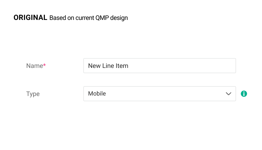
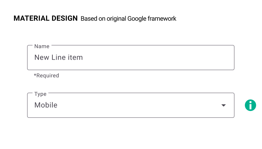
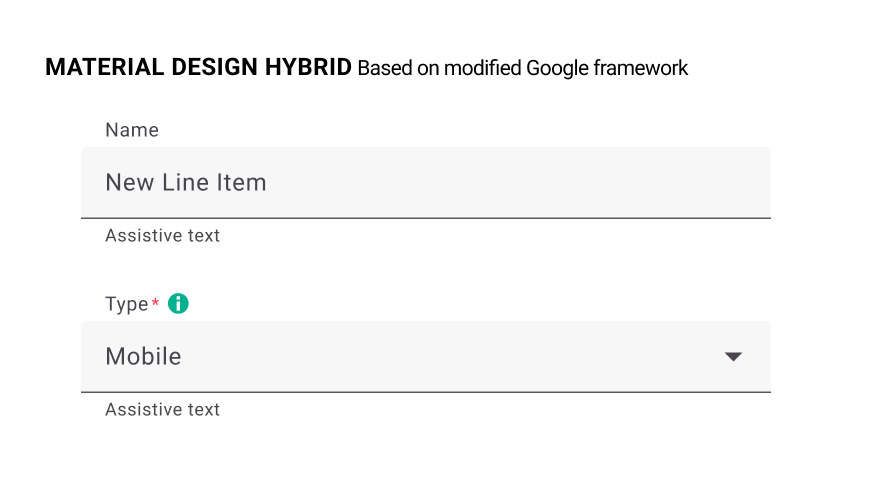
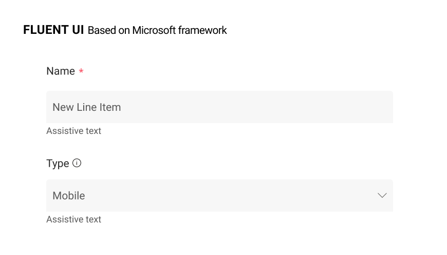
We explored different frameworks, including Material Design, Modified Material Design by Google, and Fluent UI by Microsoft. After building mockups for each, we determined Fluent UI as the best fit.
Custom design system
Due to development constraints, we decided to build our own design system based on Fluent Design but on the Angular framework. This allowed customization tailored to our needs, despite the disadvantage of not using a ready design library.
Typography
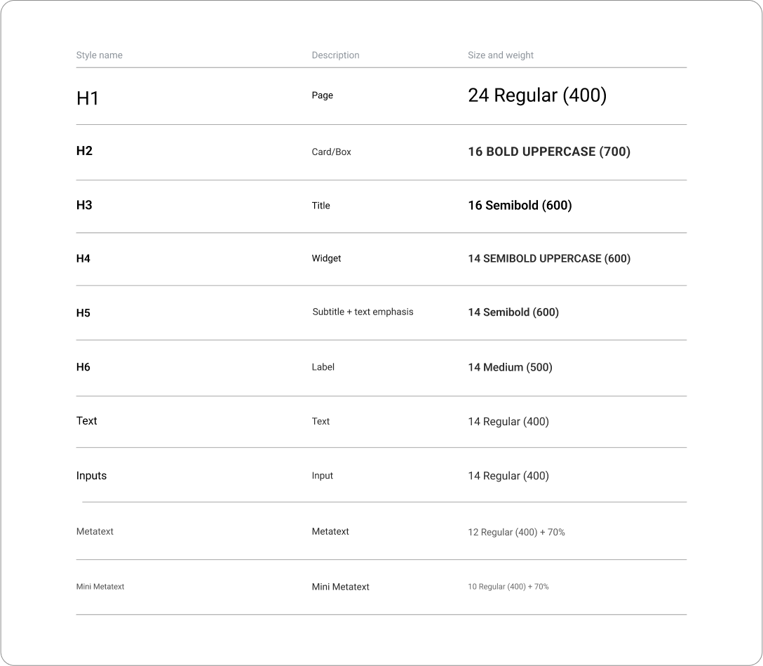
We established a clear hierarchy for text styles, ensuring consistency and readability across the platform.
Input redesign
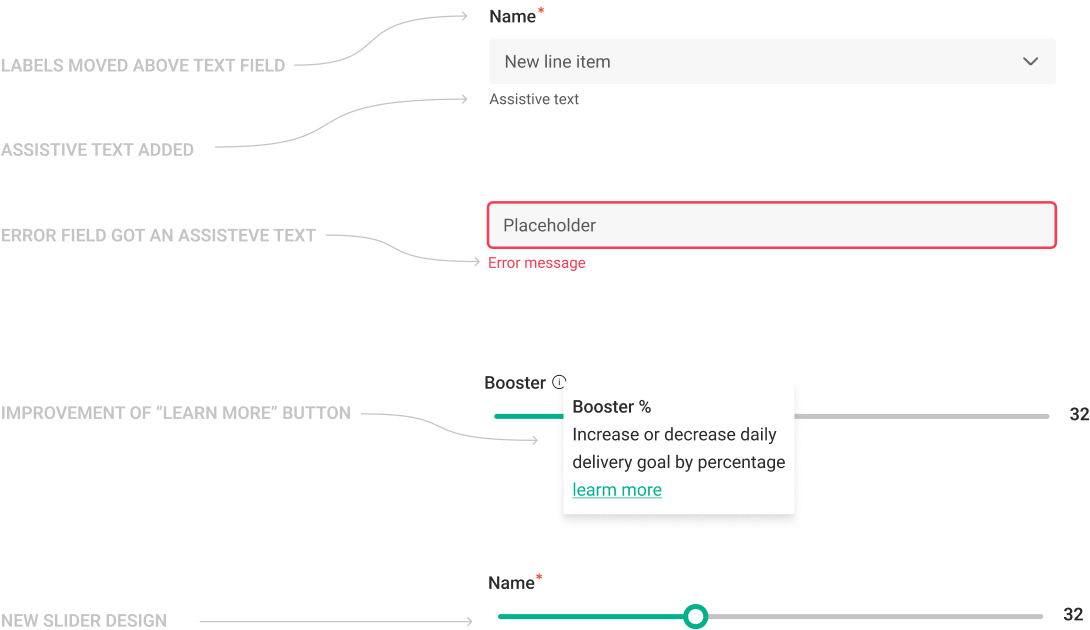
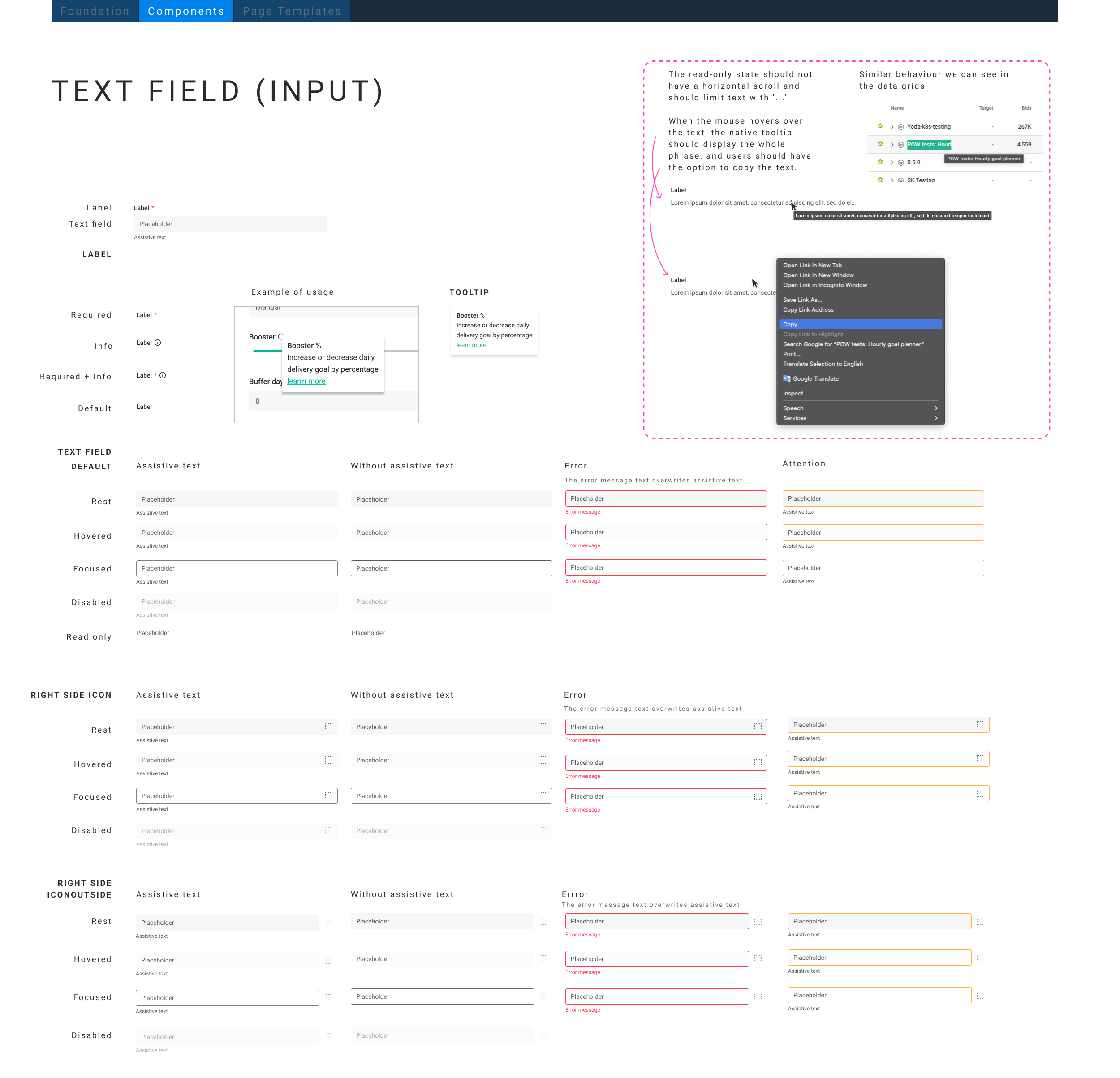
Analyzing current inputs, we made changes to enhance user-friendliness and workflow efficiency. This included moving labels above inputs, adding assistive text, and incorporating error state indicators.
Component design
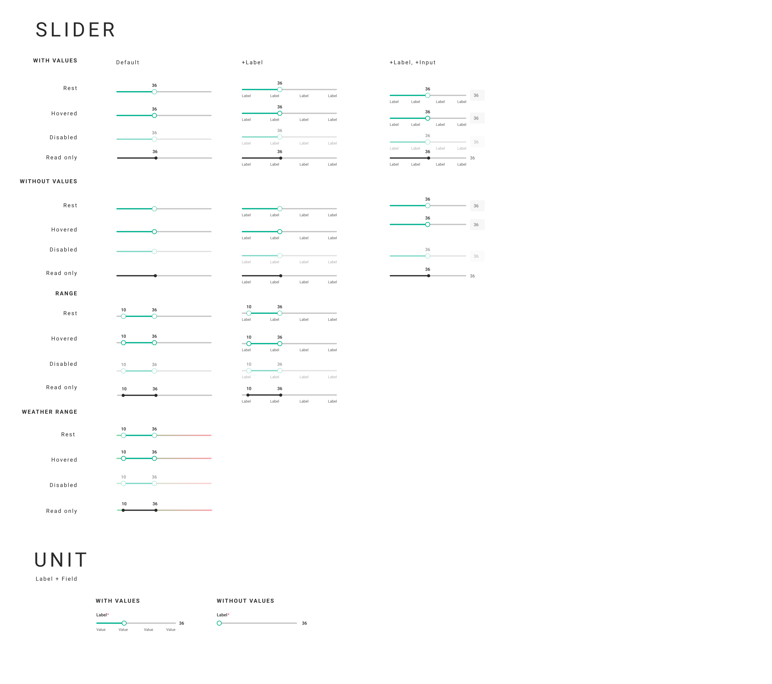
Spacing rules
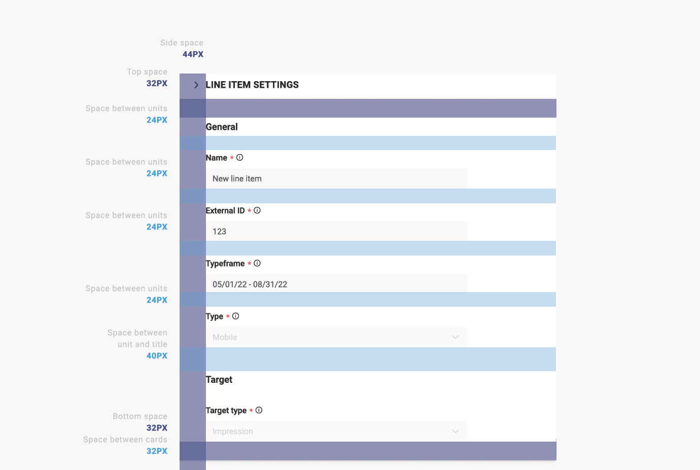
We implemented spacing rules to maintain structure and organization, ensuring spacing multiples of 4 pixels.
Prototype testing
After all the component was ready we build the different pages of the system in order to see if anything missing and present the result to the team.