Document Search - SuperDoc
A concept for storing, finding and sending personal documents in one place - the files that arrive through messengers, email and three clouds at once, and are needed most when you're already under pressure.
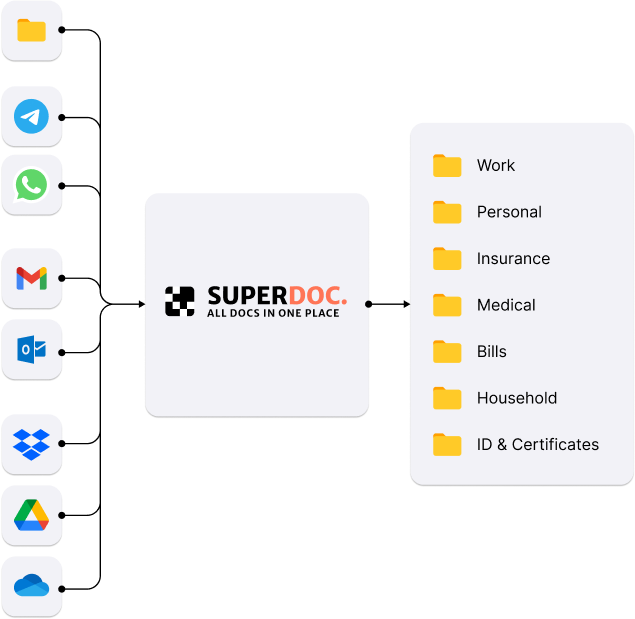
Every source in, one structure out
Documents arrive from folders, messengers, mailboxes and clouds. SuperDoc pulls them into one place and files them into categories people already use - work, personal, insurance, medical, bills, household, ID.
Documents arrive from everywhere and live nowhere
Files reach people through messengers, email and cloud services, then settle wherever they landed. Nothing is misplaced on purpose - there is simply no single place where a document belongs. The cost shows up at the worst moment: filing taxes, answering a legal request, renewing a rental agreement.
16 survey responses, 3 interviews, 2 competitor categories
The survey covered employees, freelancers, unemployed participants and retirees - most of them handle documents several times a week. Interviews with three of them showed where the breakdowns actually happen.
“INTERVIEW · PARTICIPANT 01I clearly remember someone sent me a file on WhatsApp, but then I couldn't find it anywhere - it just got lost in the flow.
“INTERVIEW · PARTICIPANT 02I urgently needed my rental agreement, but couldn't recall if it was in my email or among scanned files on my computer.
“INTERVIEW · PARTICIPANT 03I just want to organize everything - right now it's a mess, and that really frustrates me.
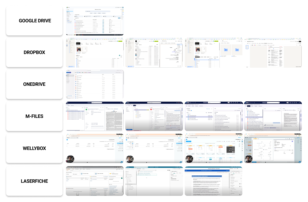
Plenty of services store documents well. None of them solved the pair that mattered here: effortless organisation together with search that is genuinely fast and intuitive.
From requirements to a structure people already think in
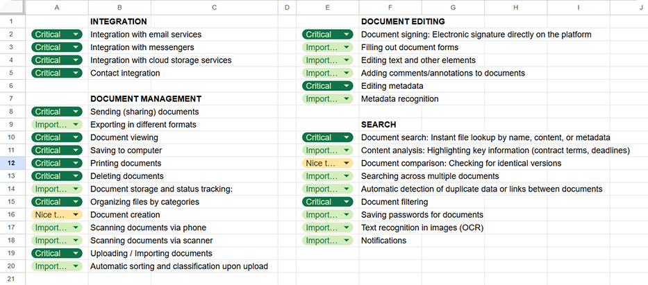
I sorted requirements into Critical, Important and Nice-to-have, then ran a CRUD and object-oriented pass with the document as the key entity. That second pass surfaced what nobody asked for out loud - printing, export, access control - but which any real document workflow needs.
Information architecture
Card sorting with friends, colleagues and classmates settled the top level: Documents, Tray, Integrations, Search & AI Assistant, Settings & Notifications.
User flow - three ways to reach one document
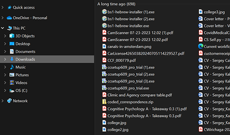
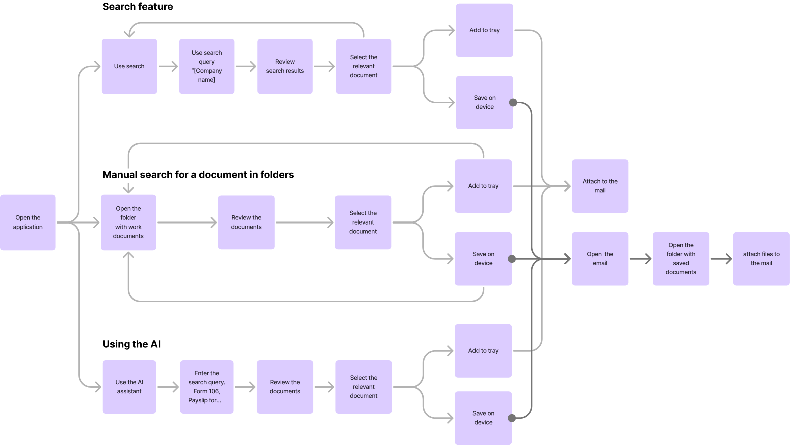
Manual navigation, text search and the AI assistant all converge on the same two endings: add to tray, or save to device. Interviews showed people were already improvising the first one by hand - collecting files in Downloads before attaching them to an email.
Low-fidelity wireframes and 1:1 testing
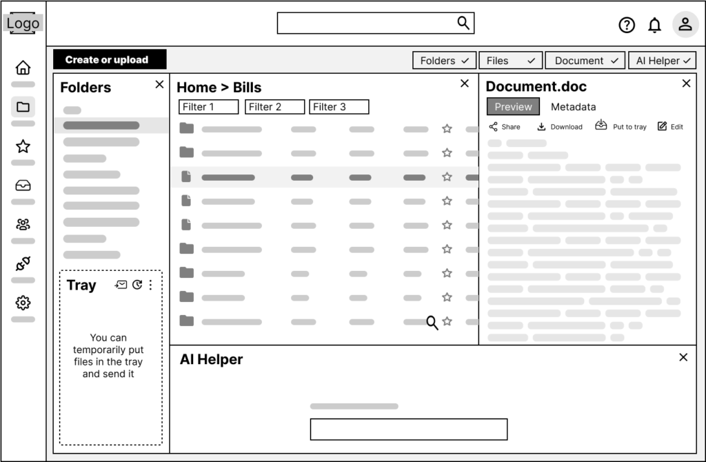
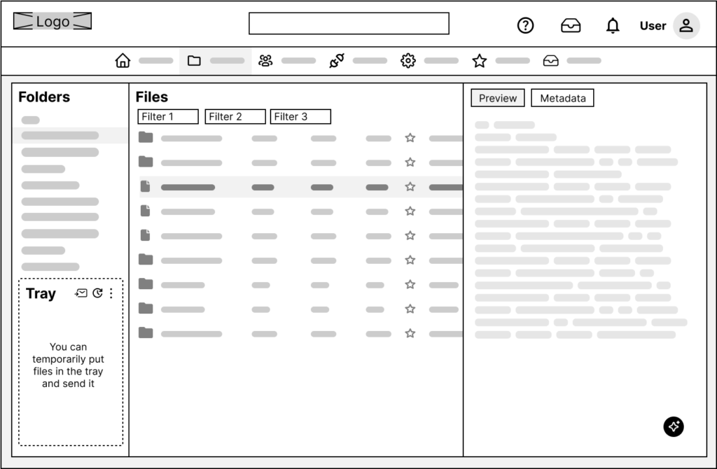
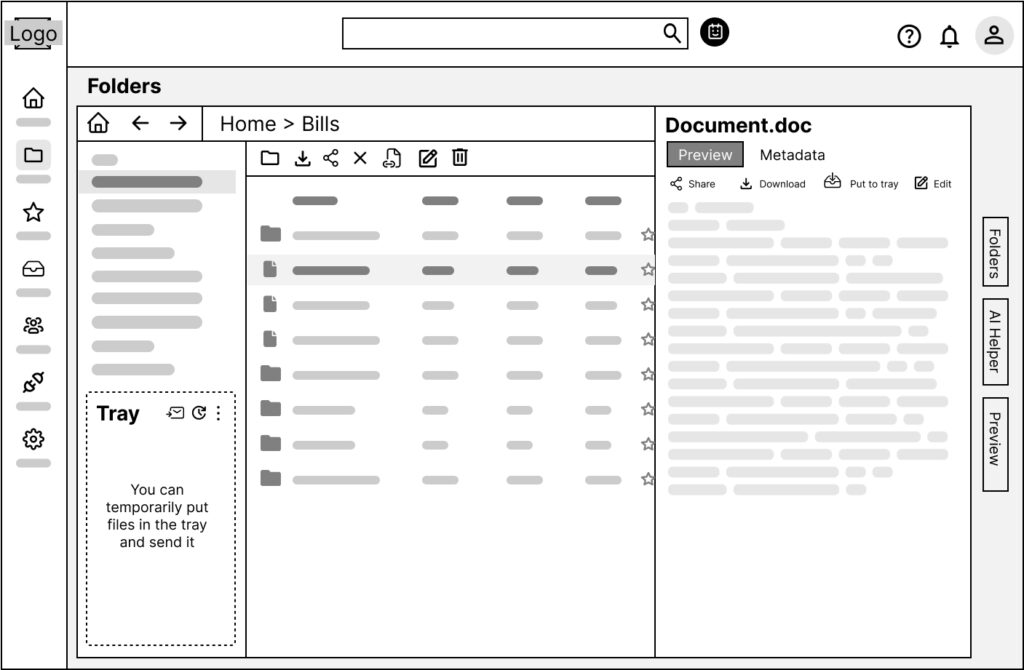
Three layouts for the same workspace: panels with the AI helper docked at the bottom, a top-nav variant, and a toolbar variant with collapsible right-hand panels. Most participants read the navigation immediately; the AI assistant was the one thing they misread, so it moved out of the panel stack and became a persistent entry point.
Mid-fidelity
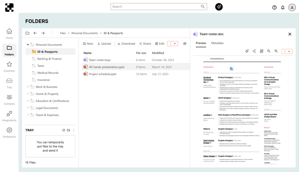
An intermediate pass to settle density and hierarchy before visual design, built alongside the first pieces of the design system - palette, type, buttons, inputs and tables.
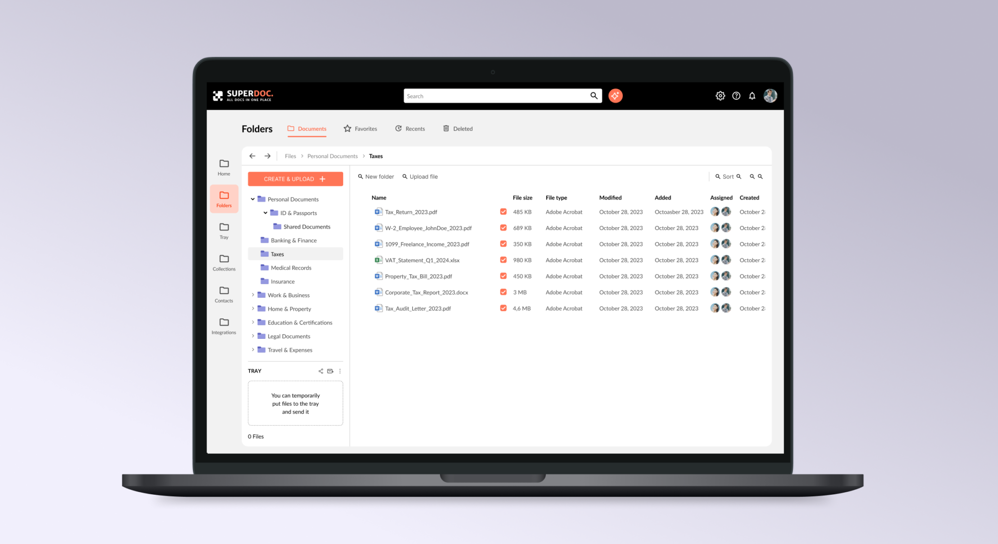
Find it three ways, collect it in the Tray, send it once
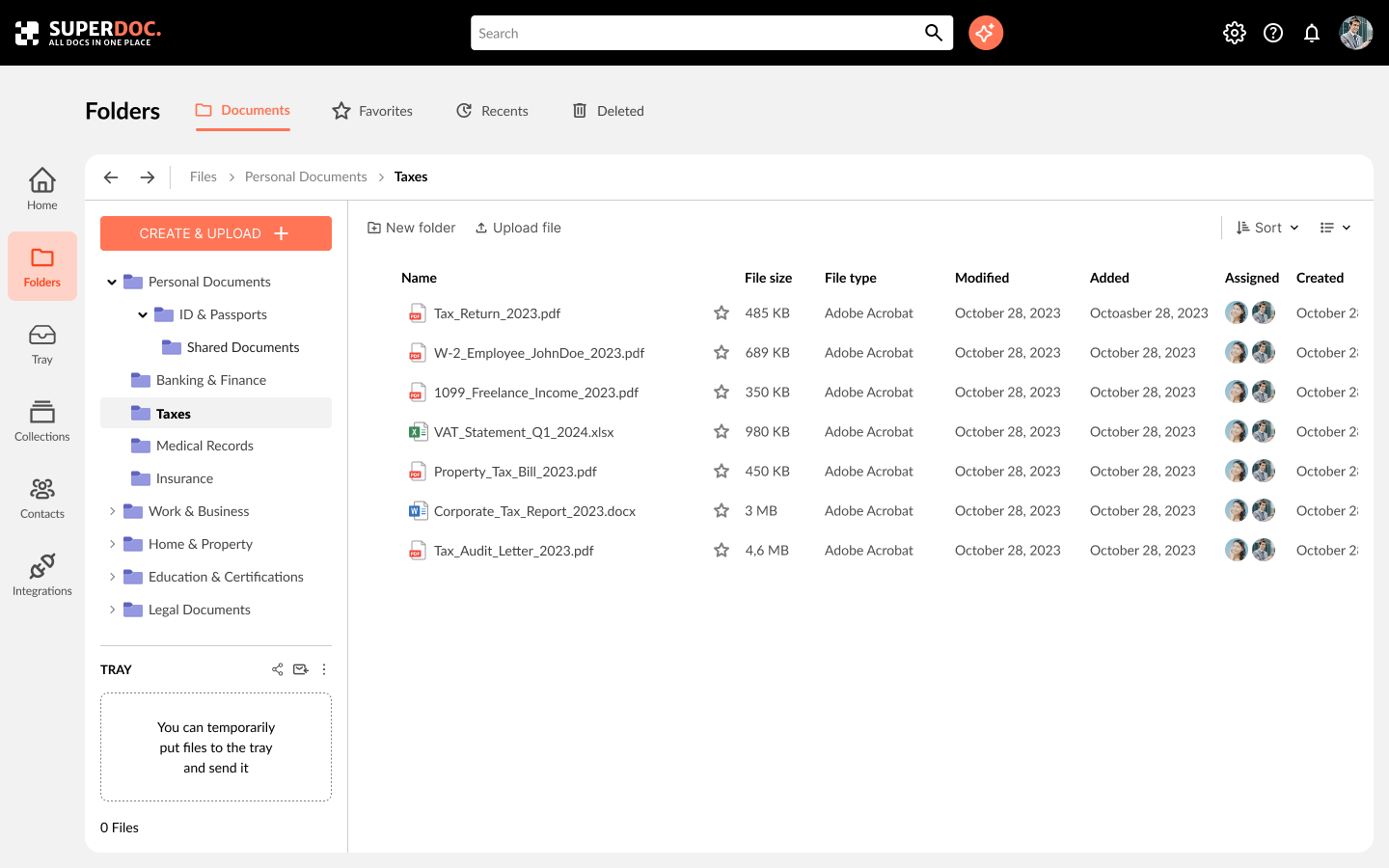
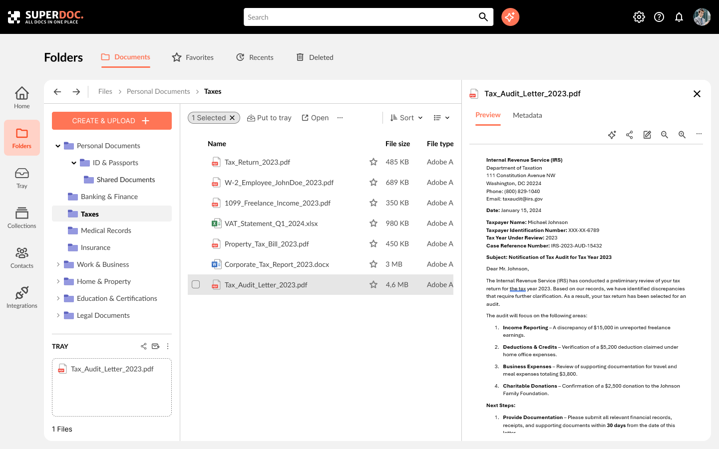
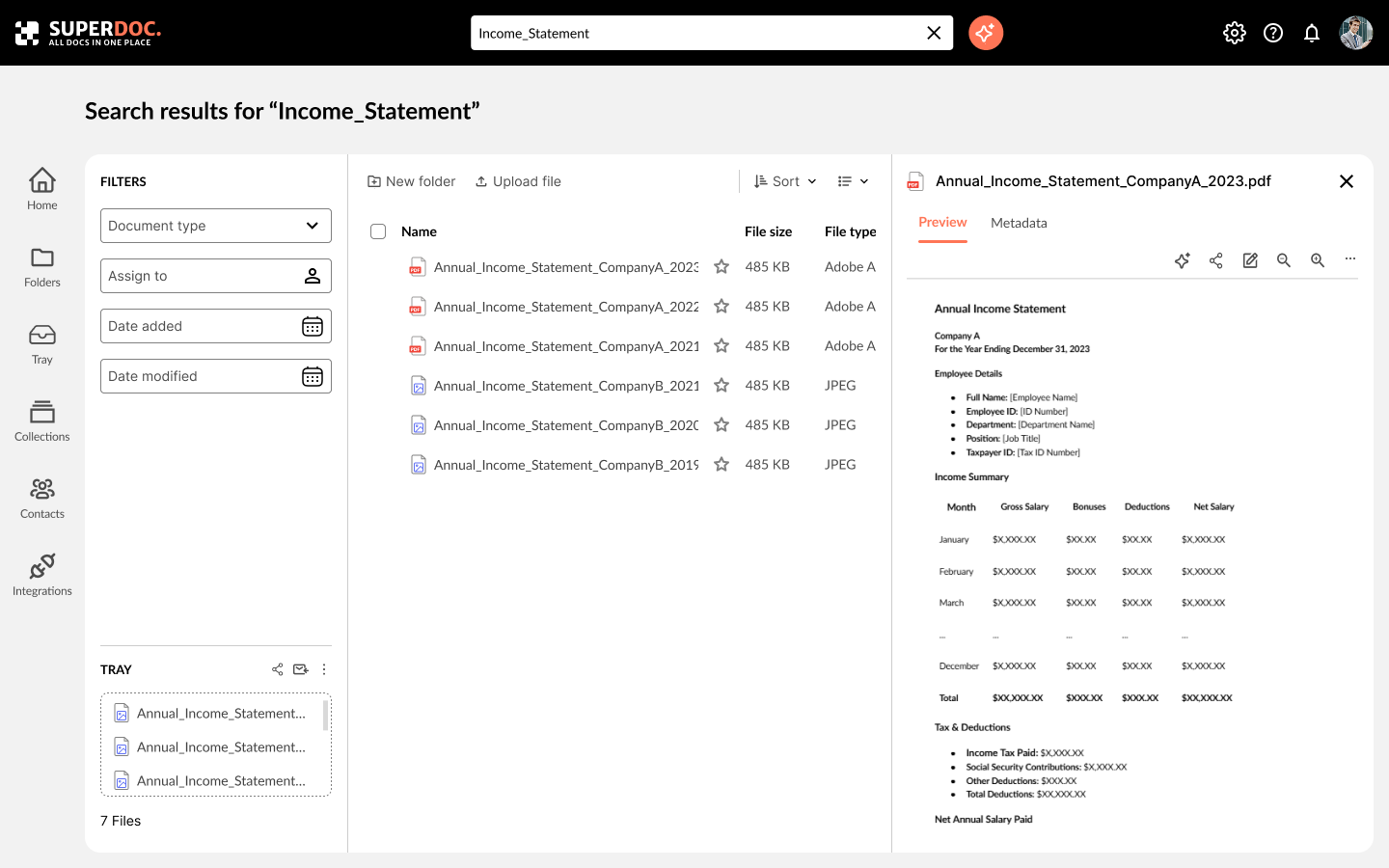
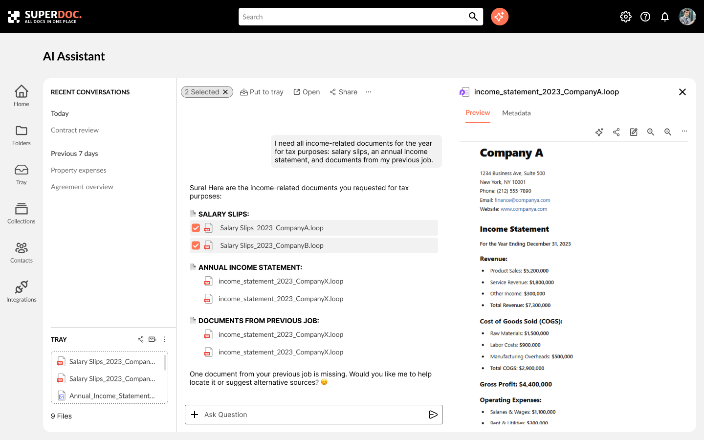
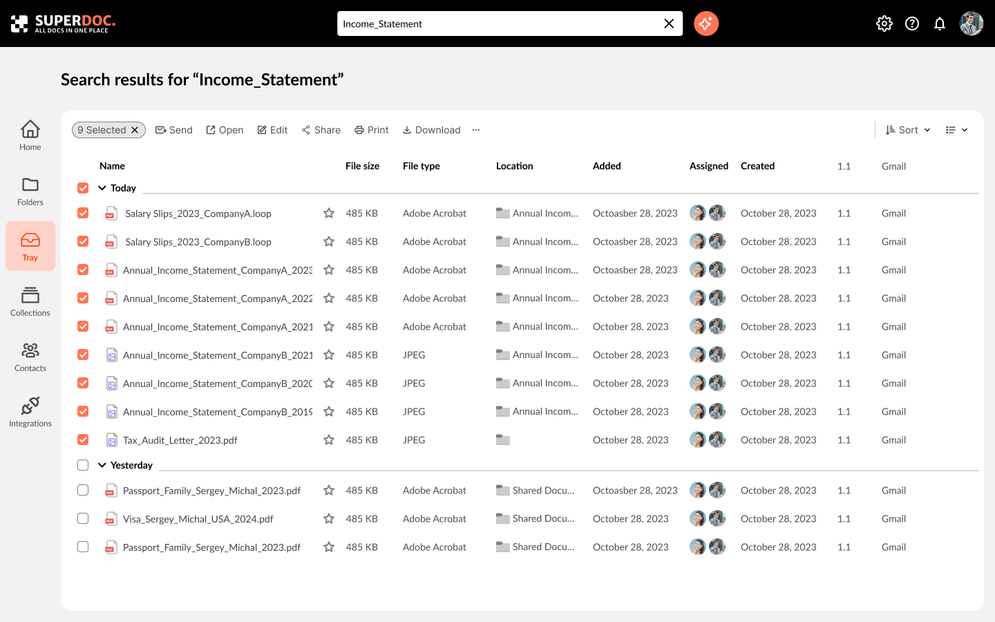
The MVP holds the one thing everything else depends on: storage and search. Folders and a file table for browsing, a text search with filters for a known name, and an AI assistant for “everything income-related for my tax return.” Whatever the route, files land in the Tray - a temporary space that collects documents without moving them, then shares, sends or clears the whole set at once.
Outcome and learnings
The strongest feature came from watching a workaround rather than reading a request: nobody asked for a Tray, but everybody was building one by hand in their Downloads folder. Testing also taught me that an AI entry point has to explain itself in the layout - the first version was understood as a chat and ignored.
Next: extend the design system, support multi-user scenarios, connect real integrations (Google Drive, email), and make the AI results more explainable.